21Q1 Service Provider Activity

Overview

About the data

  • Provided is dummy dataset for the SP data from the first three (3) months of 2021. Basic measures are included to get to high level summary insights.
  • As a dummy dataset, intuitions around which categories and states have activities may not align. Ex: Snow Removal services in Florida may be included in the dataset even though snow is rare in Florida.
  • Spend is the amount SPs budget for a given period. This amount typically stays the same across months, though it can increase and/or decrease. If spend decreases this represents churn. Note that spend can be used to get Revenue Run Rate.
  • Churn % is a key metric when evaluating SPs and is calculated: Churn / Spend.
  • Please note that this is a dummy dataset and

Goals

  • Evaluate the dataset using Google Data Studio to identify trends and gain insights to help inform changes to strategic initiatives
  • Create a presentation of your findings and answer the following questions:
    • Explain the trends for Spend and Churn. Which areas were hit hardest by Churn %?
    • Where would you focus to improve Spend?
    • A recent strategic initiative was to cease offering ads in low Spend categories. Where do you see evidence of this initiative? How is it currently performing? What additional categories would you recommend eliminating and why?
    • What additional dimensions, measures, and/or datasets would you like to have to further expand this analysis?
    • Which categories, if any, are impacted by seasonality?

Presentation

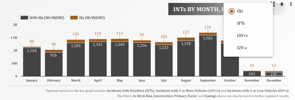
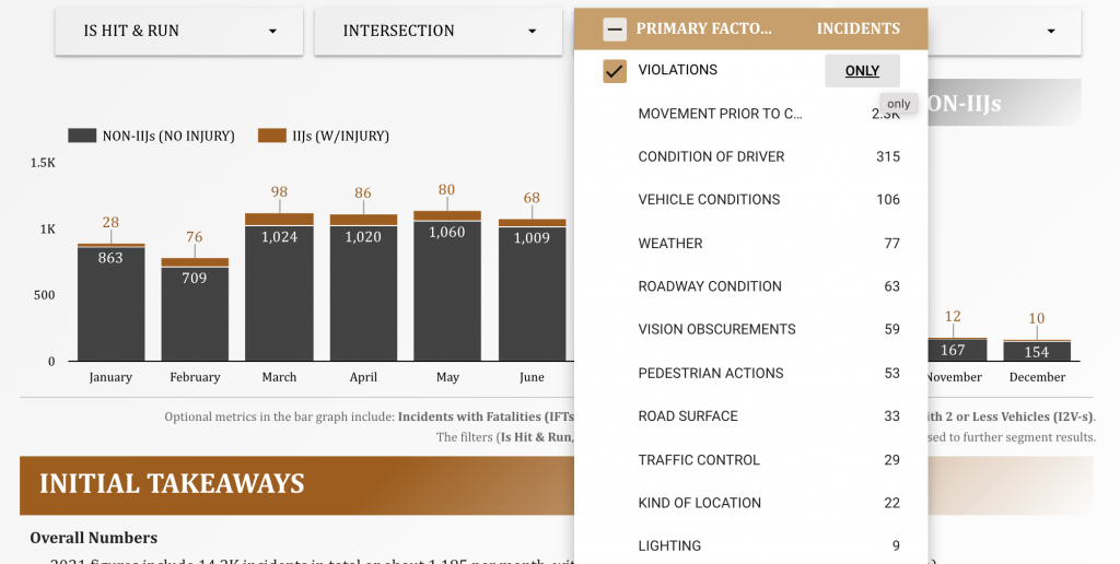
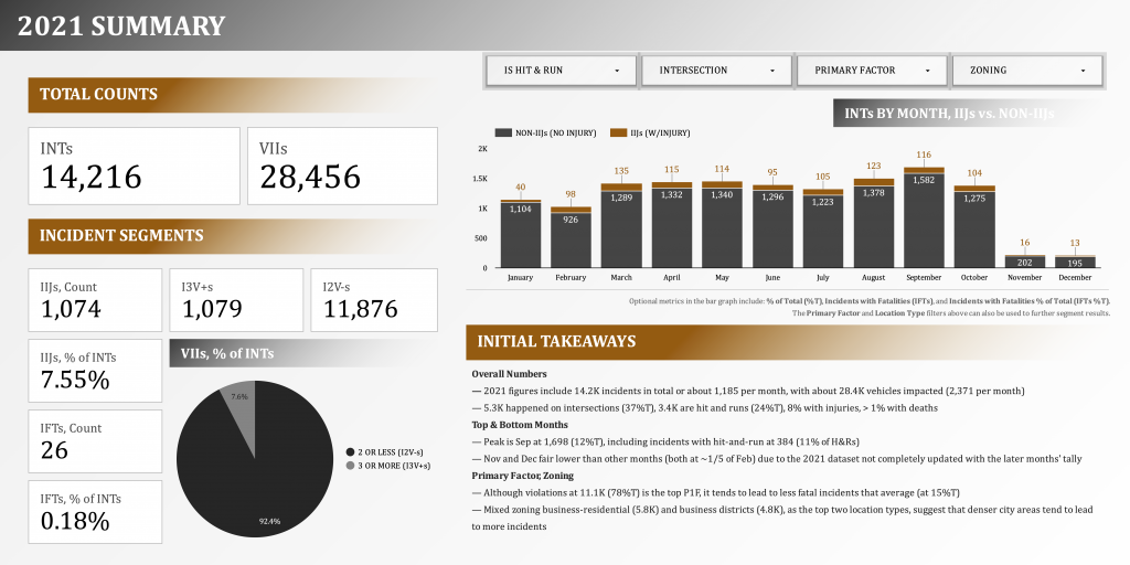
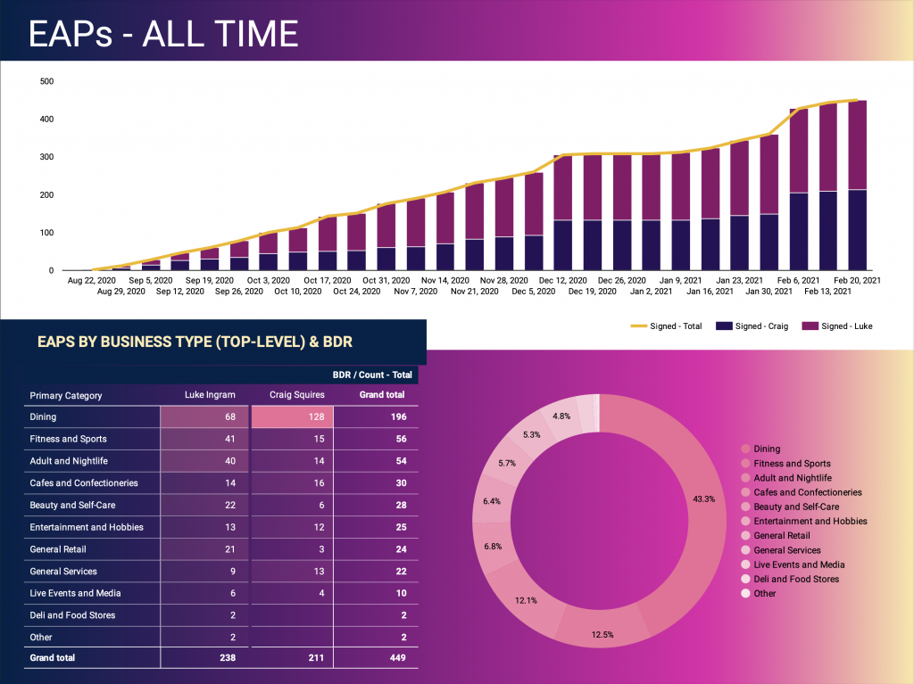
Below is a snapshot of the second page of the presentation (after the presentation overview page). Please click the image to go to the dynamic dashboard.

Baton Rouge Traffic Incidents, 2021

Overview

This is an exercise in data analysis and visualization using the Baton Rouge Traffic Incidents dataset (retrieved on Jan 10, 2022).

  • Explore Google Data Studio’s dynamic content
  • Provide initial analysis of the dataset (using historical trends as reference)

Dictionary

These are some of the key metrics and terms that are abbreviated throughout the report:

  • Incident (INT) refers to a singular report of traffic incident (or collision), identified by an incident number or ID;
  • Incident with Injury (IIJ) refers to an INT with a reported injury;
  • Incident with Fatality (IFT) refers to an INT with a reported fatality;
  • Incidents with 2 or Less Vehicles (I2V-s) refers to an INT impacting 2 or less vehicles;
  • Incidents with 3 or More Vehicles (I3V+s) refers to an INT impacting 3 or more vehicles;
  • Vehicles or Vehicles Involved in an Incident (VIIs) refers to the total number of vehicles involved in an INT and is usually bucketed as either I2V-s or I3V+s;
  • Primary Factors (P1Fs), Secondary Factors (S2Fs) refer to the factors that resulted to a collision, often a traffic violation; S2Fs may be null if there is no other identified collision factor besides the P1F

Dynamic Content

  • Interactive Graphs. Each graph has been designed to produce dynamic content in response to user feedback. Each graph has a set of secondary (optional) metrics, and each page has a set of optional filters.
  • Optional Metrics. These are graph-specific controls that allow the user to replace the default metric with another, by choosing the optional metrics selector on each graph. A list of what these metrics are can be found at the bottom of each graph. In the example below, optional metrics for the bar graph below include IFTs, I3V+s, and I2V-s.
  • Filters. These are page-specific controls that update the results in all the graphs within that page based on selected filter values. In the example below, choosing Violations updated the values of the bar graph to only include incidents that meet the Primary Factor filter criteria.

Report

Below is a snapshot of the first page of the report. Please click the image to go to the dynamic dashboard.

Visualizing TV Shows Added in 2021

Overview

This is a quick data visualization project that consolidates four streaming services data sets from Shivam Bansal‘s Kaggle repo. The streaming services included are Amazon Prime, Disney Plus, Hulu, and Netflix. All datasets are current as of Dec 12, 2021.

I implement the project using the following tools and steps:

  1. Jupyter Notebook, Python – with the csv files downloaded, I clean and combine the various data sets
  2. Google Drive (Google Sheets) – upload the database for storage and later retrieval
  3. Tableau (Public) – use the built-in Google Sheets connector and visualize the data using a dashboard

Results

Jupyter Notebook

I use Pandas to transform the CSV files into dataframes and combine them. The initial result includes listings for movies and TV shows, so movies are later removed. Some columns for cohorts (such as release_decade) are also included in the final output to anticipate categorizations in the visualization. The file can be downloaded using the link below.

Tableau

This is my foray into a more ‘fluid’ layout, making strong use of floating objects (vs. tiled), and opting out of the default tabular headers (and creating my own labels using icons and other graphic cues).

(The live dashboard can be found here.)

Surfacing Initial Sales Performance Trends

Overview

The goal of this project is to surface preliminary sales data, which includes an initial pipeline of early product users. The early adopters are small to medium sized businesses, mainly within retail, food and nightlife verticals. There are three main aspects of the initial data:

  1. Surveys, conducted by market researchers, feed into the pipeline as leads if merchant provides consent;
  2. Pipeline (EAPs) data, which focused on conversion;
  3. Market saturation (or what part of the target market is being captured), as scoped by Yelp listings.

Milestones

The main challenge is creating a foundation of Sales reporting that can scale with the rapid changes in processes, technologies and goals.

1: Setup Reporting in Google Sheets

Google Sheets becomes the starting point, since it allows for fast iterations. The reporting started as a flat file that captures rudimentary survey and pipeline data. Below is a sample of the source table of the report.

2: Visualize Data and Surface Early Trends in Tableau

Every week, the flat file is exported and updated as a data source in Tableau for a week end review.

3: Switch to Google Data Studio to Improve Visualization

To allow for real-time dashboard updates (while using existing technologies / without incurring additional costs), the visualization is moved to Google Data Studio. The underlying data connection still reference Google Sheets.

4: Use Brand Colors

The switch to Google Data Studio coincides with the release of company style sheets. The visualization redesign adopts the recommended color palette and gradient styles.

5: Surface Initial Trends

Using Yelp as benchmark, specific market verticals are investigated to understand market capture or saturation.