Visualizing TV Shows Added in 2021

Overview

This is a quick data visualization project that consolidates four streaming services data sets from Shivam Bansal‘s Kaggle repo. The streaming services included are Amazon Prime, Disney Plus, Hulu, and Netflix. All datasets are current as of Dec 12, 2021.

I implement the project using the following tools and steps:

  1. Jupyter Notebook, Python – with the csv files downloaded, I clean and combine the various data sets
  2. Google Drive (Google Sheets) – upload the database for storage and later retrieval
  3. Tableau (Public) – use the built-in Google Sheets connector and visualize the data using a dashboard

Results

Jupyter Notebook

I use Pandas to transform the CSV files into dataframes and combine them. The initial result includes listings for movies and TV shows, so movies are later removed. Some columns for cohorts (such as release_decade) are also included in the final output to anticipate categorizations in the visualization. The file can be downloaded using the link below.

Tableau

This is my foray into a more ‘fluid’ layout, making strong use of floating objects (vs. tiled), and opting out of the default tabular headers (and creating my own labels using icons and other graphic cues).

(The live dashboard can be found here.)

Surfacing Initial Sales Performance Trends

Overview

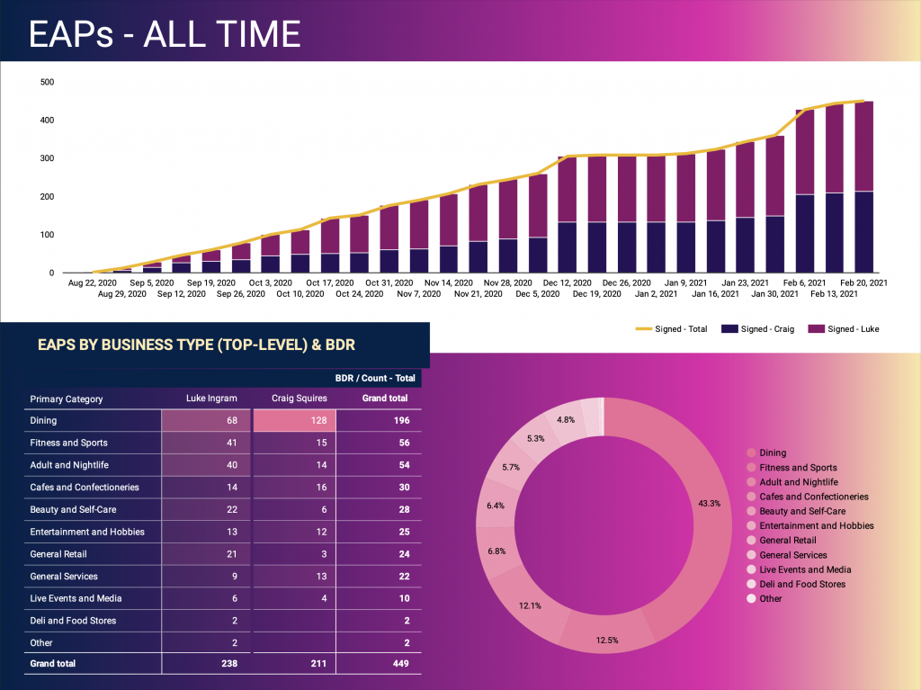
The goal of this project is to surface preliminary sales data, which includes an initial pipeline of early product users. The early adopters are small to medium sized businesses, mainly within retail, food and nightlife verticals. There are three main aspects of the initial data:

  1. Surveys, conducted by market researchers, feed into the pipeline as leads if merchant provides consent;
  2. Pipeline (EAPs) data, which focused on conversion;
  3. Market saturation (or what part of the target market is being captured), as scoped by Yelp listings.

Milestones

The main challenge is creating a foundation of Sales reporting that can scale with the rapid changes in processes, technologies and goals.

1: Setup Reporting in Google Sheets

Google Sheets becomes the starting point, since it allows for fast iterations. The reporting started as a flat file that captures rudimentary survey and pipeline data. Below is a sample of the source table of the report.

2: Visualize Data and Surface Early Trends in Tableau

Every week, the flat file is exported and updated as a data source in Tableau for a week end review.

3: Switch to Google Data Studio to Improve Visualization

To allow for real-time dashboard updates (while using existing technologies / without incurring additional costs), the visualization is moved to Google Data Studio. The underlying data connection still reference Google Sheets.

4: Use Brand Colors

The switch to Google Data Studio coincides with the release of company style sheets. The visualization redesign adopts the recommended color palette and gradient styles.

5: Surface Initial Trends

Using Yelp as benchmark, specific market verticals are investigated to understand market capture or saturation.